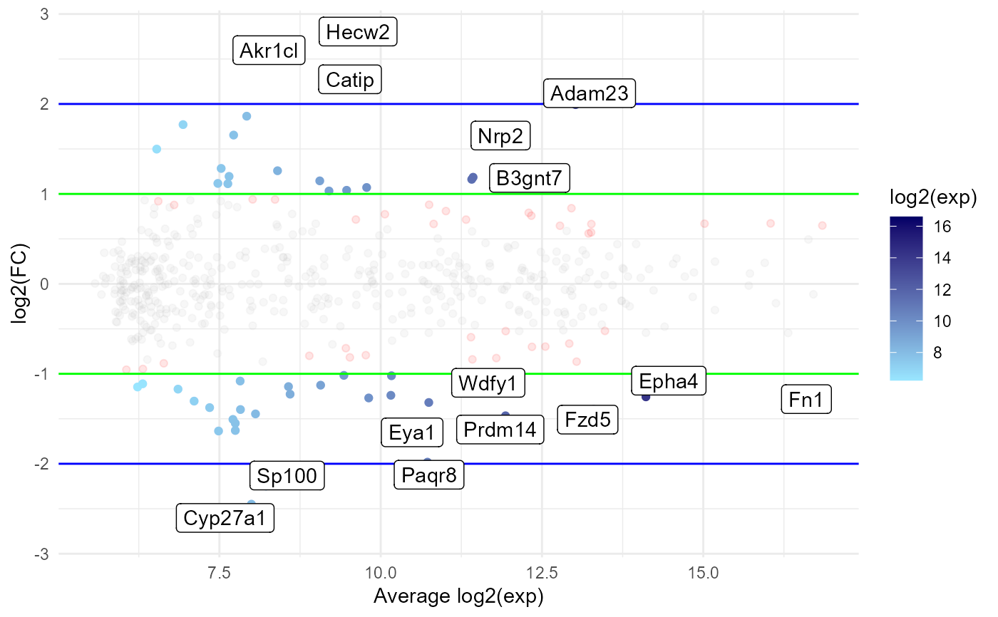
Create an MA plot visualising differential expression (DE) results
Source:R/DEplotFuns.R
ma_plot.RdThis function creates an MA plot to visualise the results of a DE analysis.
ma_enhance is called indirectly by
ma_plot to add extra features.
Usage
ma_plot(
  genes.de.results,
  pval.threshold = 0.05,
  lfc.threshold = 1,
  alpha = 0.1,
  ylims = NULL,
  add.colours = TRUE,
  add.expression.colour.gradient = TRUE,
  add.guide.lines = TRUE,
  add.labels.auto = TRUE,
  add.labels.custom = FALSE,
  ...
)

ma_enhance(
  p,
  df,
  pval.threshold,
  lfc.threshold,
  alpha,
  add.colours,
  point.colours = c("#bfbfbf", "orange", "red", "blue"),
  raster = FALSE,
  add.expression.colour.gradient,
  colour.gradient.scale = list(left = c("#99e6ff", "#000066"), right = c("#99e6ff",
    "#000066")),
  colour.gradient.breaks = waiver(),
  colour.gradient.limits = NULL,
  add.guide.lines,
  guide.line.colours = c("green", "blue"),
  add.labels.auto,
  add.labels.custom,
  annotation = NULL,
  n.labels.auto = c(5, 5, 5),
  genes.to.label = NULL,
  seed = 0,
  label.force = 1
)
Arguments
- genes.de.results
the table of DE genes, usually generated by
DEanalysis_edger- pval.threshold, lfc.threshold
the p-value and/or log2(fold-change) thresholds to determine whether a gene is DE
- alpha
the transparency of points; ignored for DE genes if add.expression.colour.gradient is TRUE; default is 0.1
- ylims
a single value to create (symmetric) y-axis limits; by default inferred from the data
- add.colours
whether to colour genes based on their log2(fold-change) and -log10(p-value); default is TRUE
- add.expression.colour.gradient
whether to add a colour gradient for DE genes to present their log2(expression); default is TRUE
- add.guide.lines
whether to add vertical and horizontal guide lines to the plot to highlight the thresholds; default is TRUE
- add.labels.auto
whether to automatically label genes with the highest |log2(fold-change)| and expression; default is TRUE
- add.labels.custom
whether to add labels to user-specified genes; the parameter genes.to.label must also be specified; default is FALSE
- ...
parameters passed on to
ma_enhance- p
MA plot as a ggplot object (usually passed by
ma_plot)- df
data frame of DE results for all genes (usually passed by
ma_plot)- point.colours
a vector of 4 colours to colour genes with both pval and lfc under thresholds, just pval under threshold, just lfc under threshold, both pval and lfc over threshold (DE genes) respectively; only used if add.colours is TRUE
- raster
whether to rasterize non-DE genes with ggraster to reduce memory usage; particularly useful when saving plots to files
- colour.gradient.scale
a vector of two colours to create a colour gradient for colouring the DE genes based on expression; a named list with components left and right can be supplied to use two different colour scales; only used if add.expression.colour.gradient is TRUE
- colour.gradient.breaks, colour.gradient.limits
parameters to customise the legend of the colour gradient scale; especially useful if creating multiple plots or a plot with two scales; only used if add.expression.colour.gradient is TRUE
- guide.line.colours
a vector with two colours to be used to colour the guide lines; the first colour is used for the p-value and log2(fold-change) thresholds and the second for double those values
- annotation
annotation data frame containing a match between the gene field of df (usually ENSEMBL IDs) and the gene names that should be shown in the plot labels; not necessary if df already contains gene names
- n.labels.auto
a integer vector of length 3 denoting the number of genes that should be automatically labelled; the first entry corresponds to DE genes with the lowest p-value, the second to those with highest absolute log2(fold-change) and the third to those with highest expression; a single integer can also be specified, to be used for all 3 entries; default is 5
- genes.to.label
a vector of gene names to be labelled in the plot; if names are present those are shown as the labels (but the values are the ones matched - this is to allow custom gene names to be presented)
- seed
the random seed to be used for reproducibility; only used for ggrepel::geom_label_repel if labels are present
- label.force
passed to the force argument of ggrepel::geom_label_repel; higher values make labels overlap less (at the cost of them being further away from the points they are labelling)
Examples
expression.matrix.preproc <- as.matrix(read.csv(
  system.file("extdata", "expression_matrix_preprocessed.csv", package = "bulkAnalyseR"),
  row.names = 1
))[1:500, 1:4]

anno <- AnnotationDbi::select(
  getExportedValue('org.Mm.eg.db', 'org.Mm.eg.db'),
  keys = rownames(expression.matrix.preproc),
  keytype = 'ENSEMBL',
  columns = 'SYMBOL'
) %>%
  dplyr::distinct(ENSEMBL, .keep_all = TRUE) %>%
  dplyr::mutate(NAME = ifelse(is.na(SYMBOL), ENSEMBL, SYMBOL))
#> 'select()' returned 1:many mapping between keys and columns

edger <- DEanalysis_edger(
  expression.matrix = expression.matrix.preproc,
  condition = rep(c("0h", "12h"), each = 2),
  var1 = "0h",
  var2 = "12h",
  anno = anno
)
mp <- ma_plot(edger)
print(mp)
